Con-Rehab AS
Identity and website development for a construction company
A Norway based company Con-Rehab AS specialises in concrete renovation and
cathodic protection. We were asked to help them with a corporate image and online strategy.
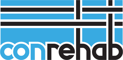
Branding. A proposed logo design contains an allusion of
intersecting reinforcement bars in a solid structure. Our secondary task was to
mimic the cross symbolism, found in most Scandinavian flags as the company is
mainly targeting its business in Northern Europe. Selected colour emphasizes
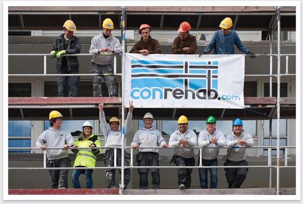
renewal and service trustworthiness. The logo was implemented on outdoor
banners, workwear and company vehicles.

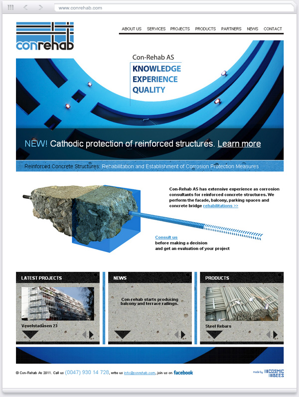
Website. Main goal was to design a website was to introduce the
exclusive company services and explain the sophisticated technologies. Another task was
to showcase the accomplished projects in a "before/after" manner.
Looks like the guys are happy with the results
