Modulinus
Branding and website for the cleanroom design company
We were asked to develop a brand and a website for cleanroom design and construction company Modulinus. As the company specializes in modular cleanroom solutions, we wanted to stay with a strong wordmark logo to emphasize the type of approach.

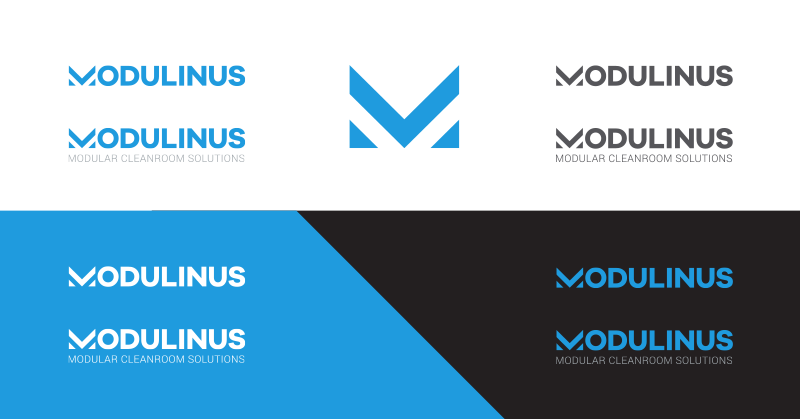
A stylized letter M was transformed into three modular sections, thus visualizing the concept of modular
cleanroom construction. Light blue color is a mix of a medical turquoise and electric blue as to span
both cleanroom industries - pharmaceutical and electronic. Light tone of
the blue is associated with modern industrialism and is here to tell innovative technological qualities of the company. Monocolor is used to
highlight continuity and to represent the contamination-free environment, which is the number one service company is selling. Several logo variations may be used in press and digital media:
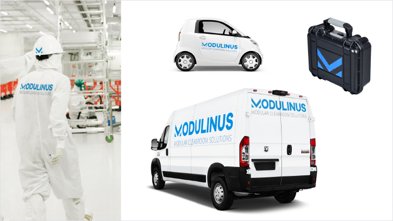
We designed a full brandbook for Modulinus that contains corporate identity guidelines with brand colours and typography to be used in online and offline media. The most common graphic templates were prepared, such as business cards, invoices, letterheads and brochures. Below is a preview of clothing and decals:
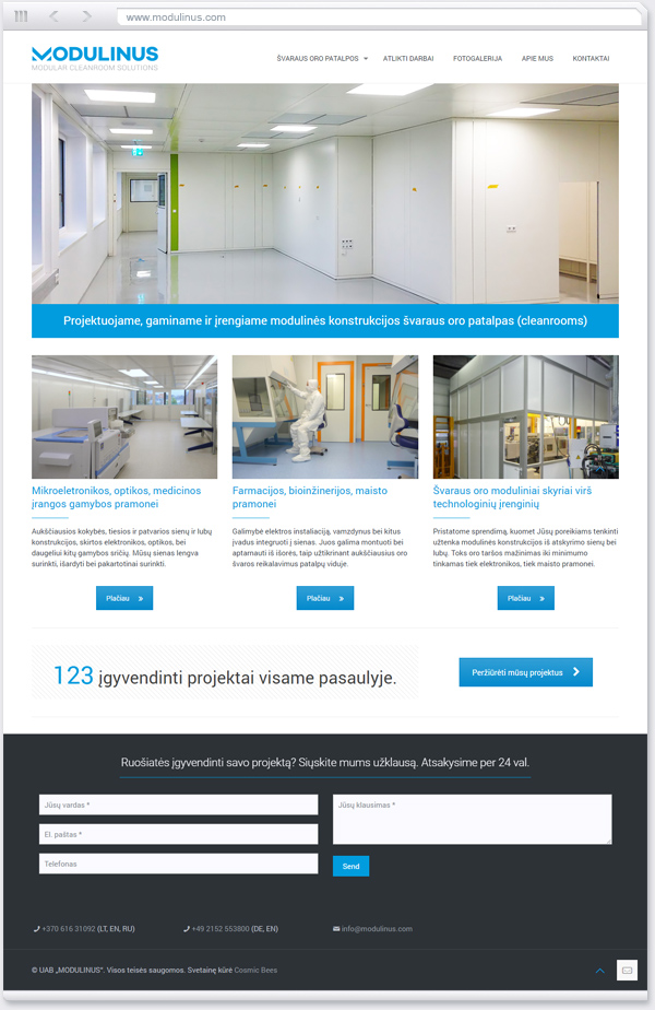
The following task was to design a responsive and modern website, using Wordpress publishing platform. The information architecture was developed upon a dual model of cleanrooms' purpose, as they are divided into pharmaceutical and electronic. The company has a huge experience and over 100 projects completed worldwide. We built a portfolio section alongside with project references and a photo gallery. Please visit live version modulinus.com.